Visualizing various types of data
Lecture 3
Dr. Benjamin Soltoff
Cornell University
INFO 5001 - Fall 2025
September 2, 2025
Announcements
Announcements
- Use the discussion board for course-related questions
- Homework 00 tomorrow
Learning objectives
- Generate statistical graphs using the grammar of graphics and {ggplot2}
- Evaluate different types of geometric objects applied to the same variables
- Modify visual scales to improve readability of charts
Coding style + workflow
Use the {tidyverse} style guide
Avoid long lines of code
- We should be able to see all of your code in the PDF document you submit.
- Do not rely on automatic line wrapping. It is not consistent.
Format using Air
Label code cells
- Do not put spaces in the code cell
labels.
- Do not put spaces in the code cell
Render, commit, and push regularly
- Think about it like clicking to save regularly as you type a report
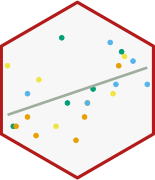
Warm up
Revisiting average heights
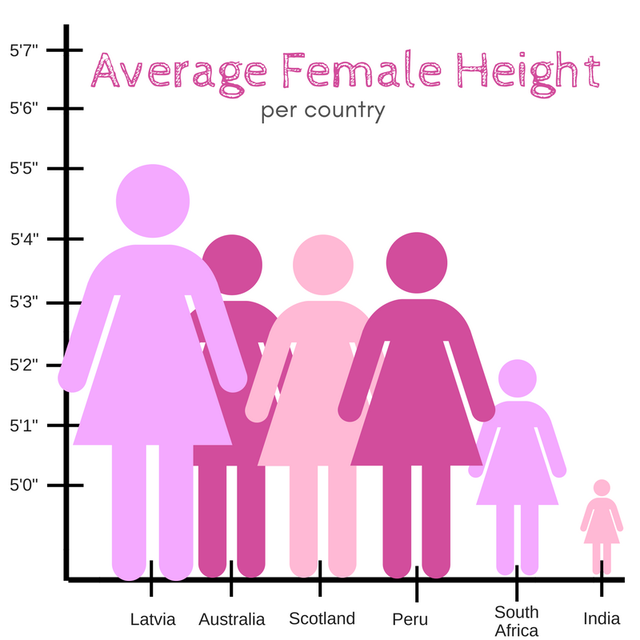
Illustration credit: @reina_sabah
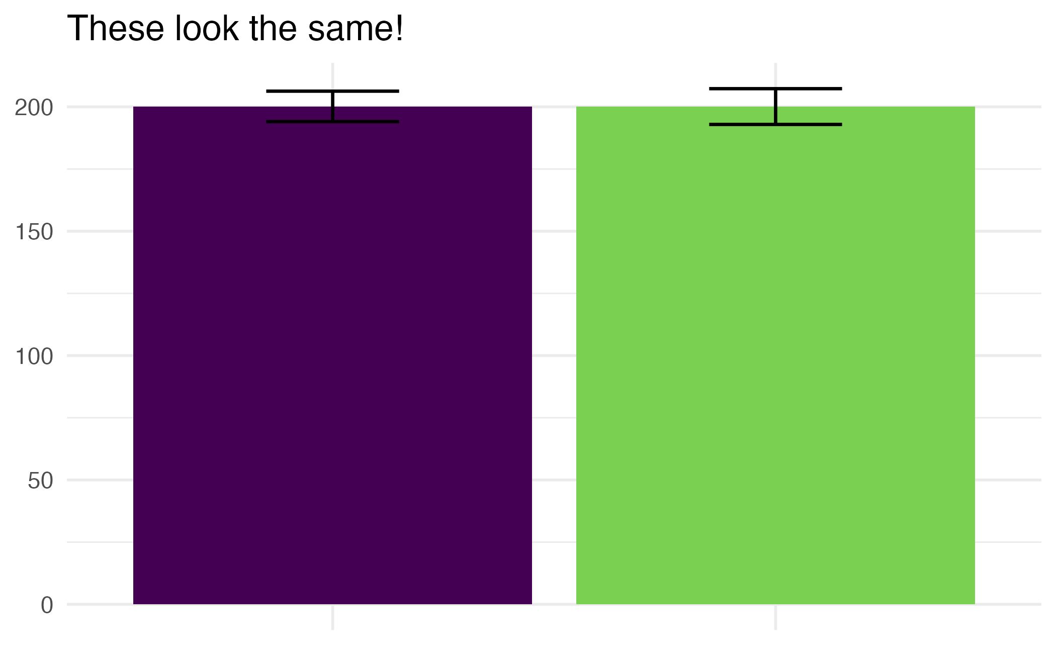
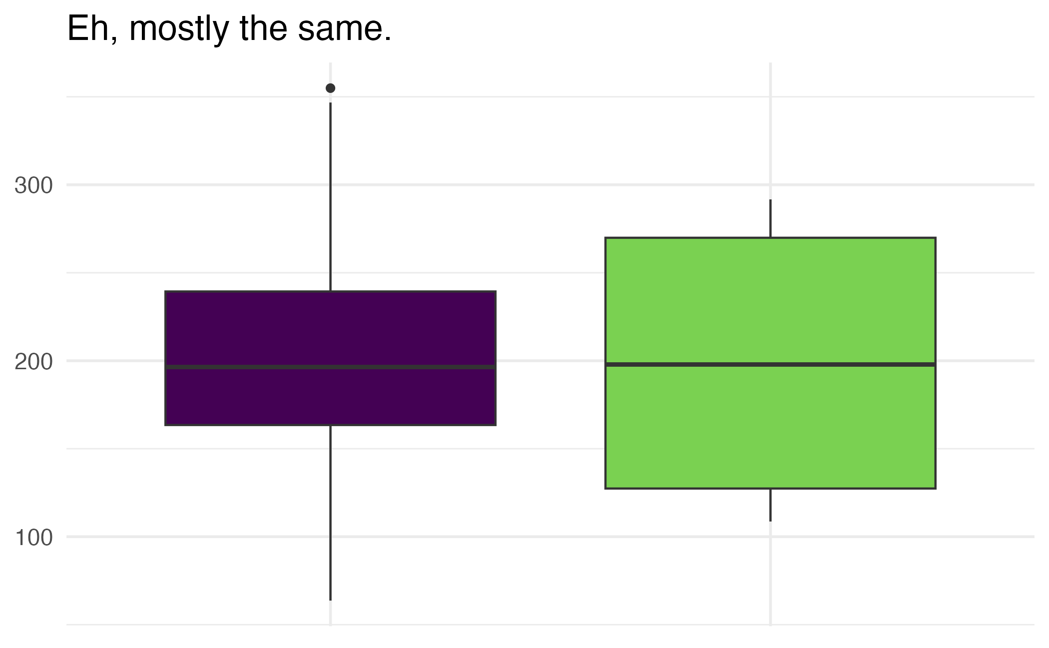
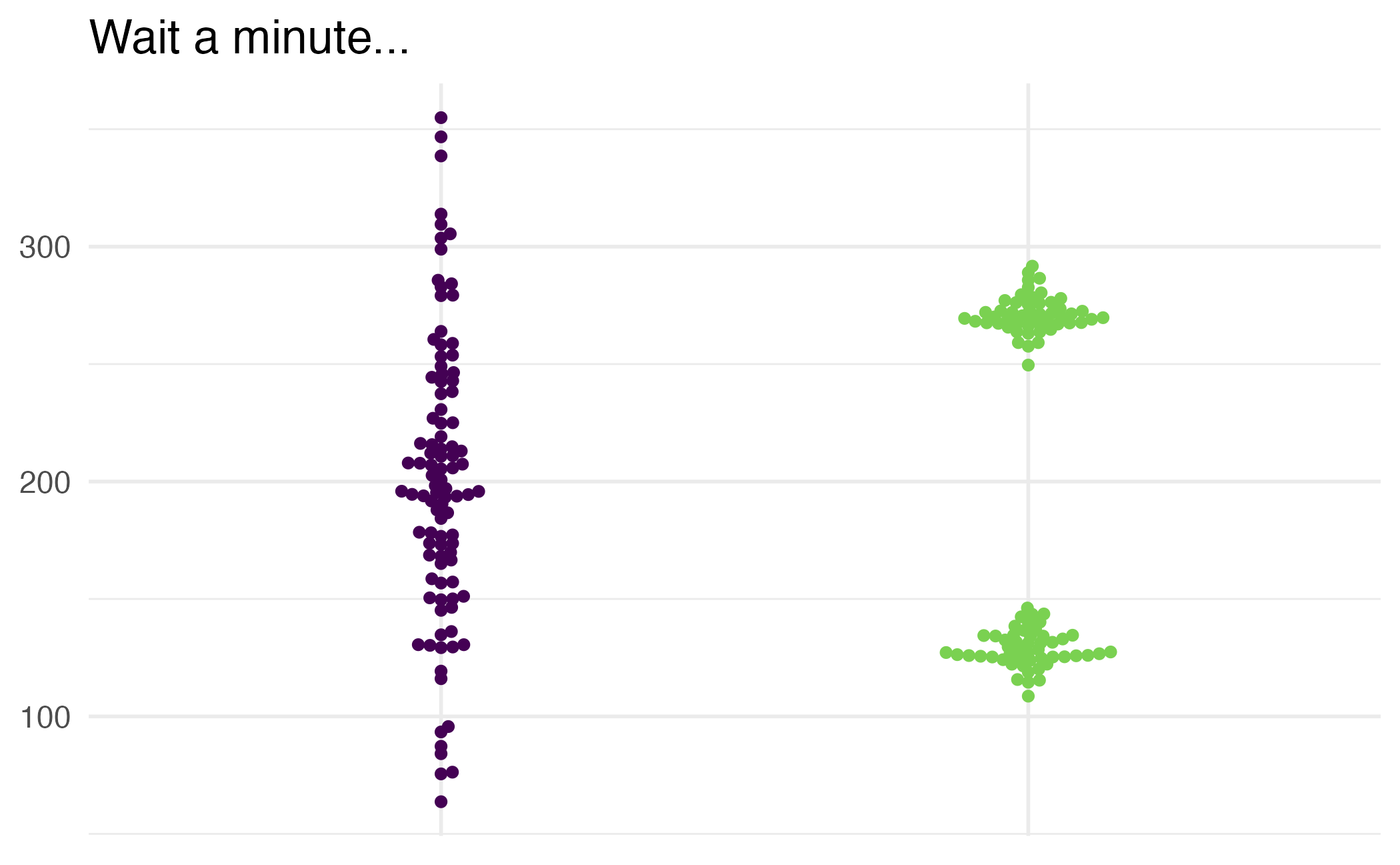
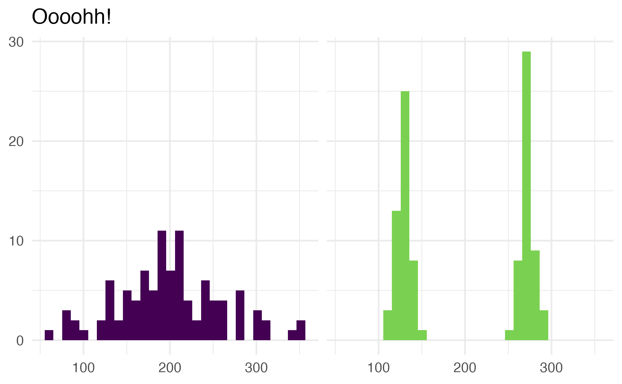
The way data is displayed matters
What do these plots show?
Application exercise
The prognosticator of all prognosticators
ae-01
Note
- Go to the course GitHub org and find your
ae-01(repo name will be suffixed with your GitHub name). - Clone the repo in Positron, run
renv::restore()to install the required packages, open the Quarto document in the repo, and follow along and complete the exercises. - Render, commit, and push your edits by the AE deadline – end of the day
Wrap up
Recap
- Pick geoms based on data types.
- Set appropriate binwidths for histograms.
- Turn off legends when they provide redundant information with
show.legend = FALSE. - Create plots with multiple geoms, and pay attention to order.