Presentation tips
Lecture 25
December 2, 2025
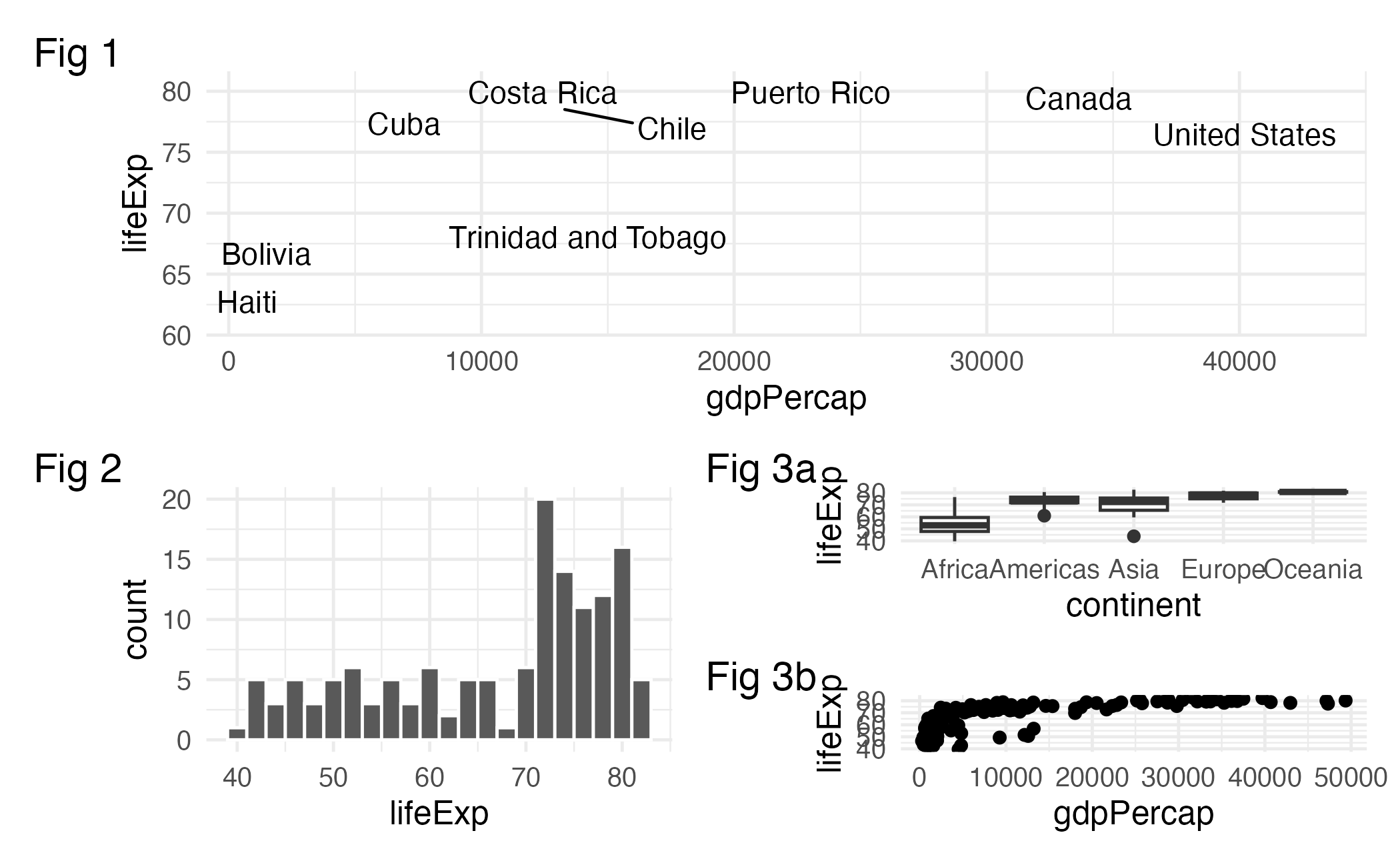
Is that gray background okay?
It adds contrast! Some people just don’t like it 🤷🏽

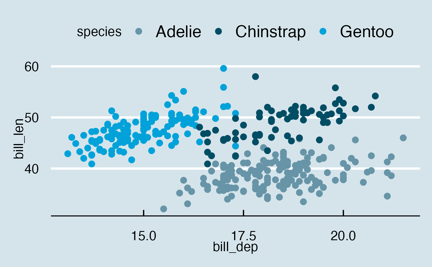
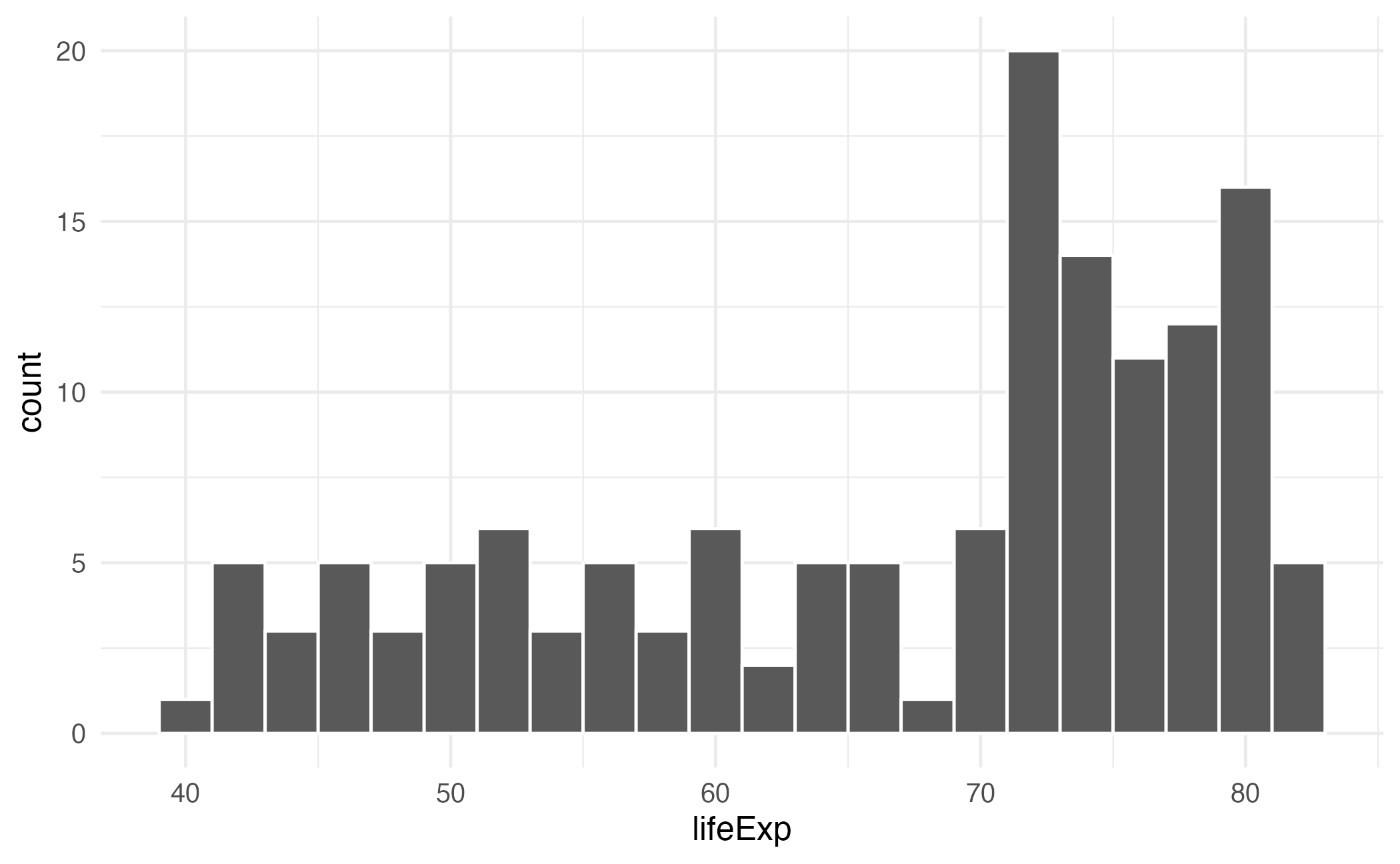
Like this!
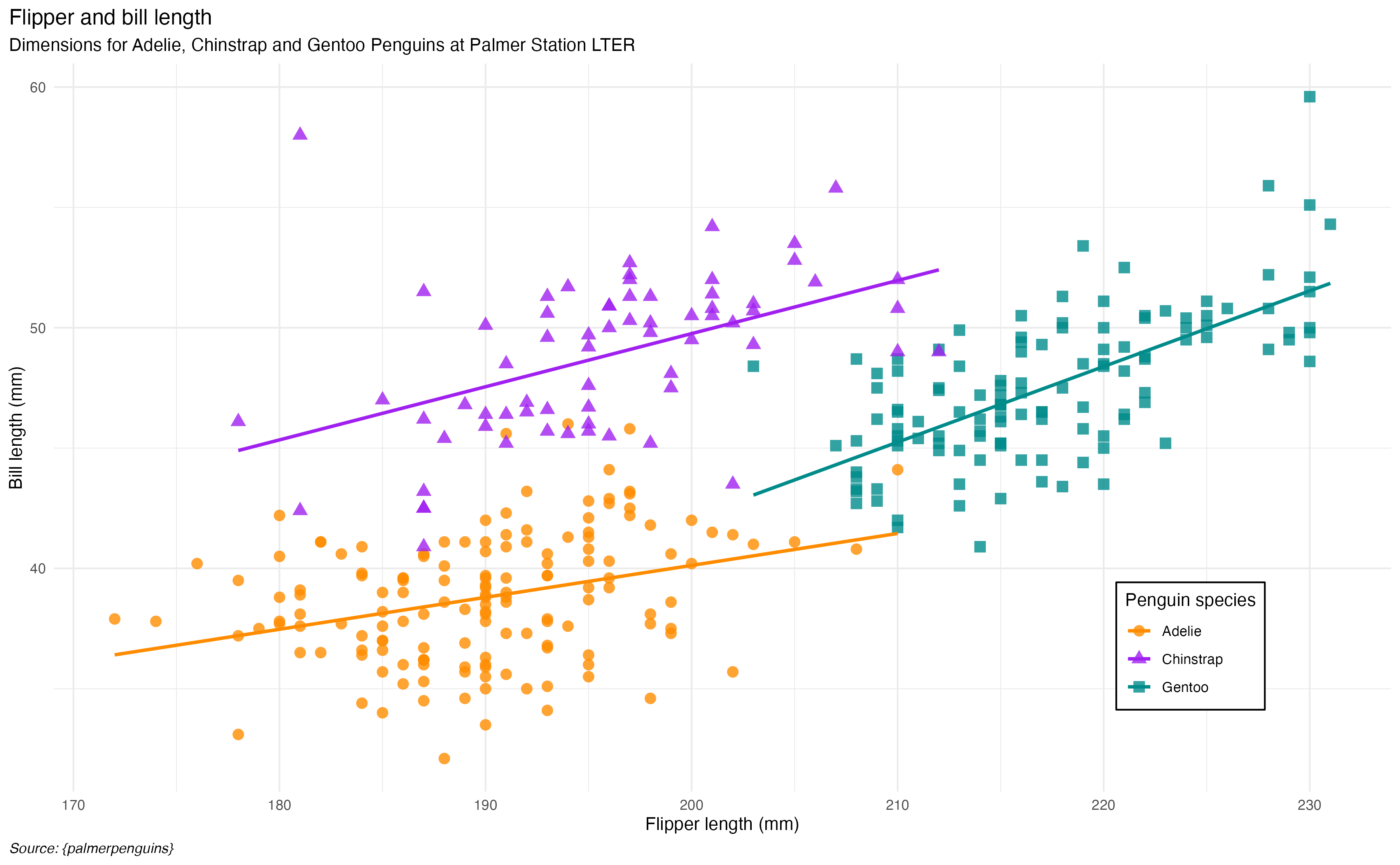
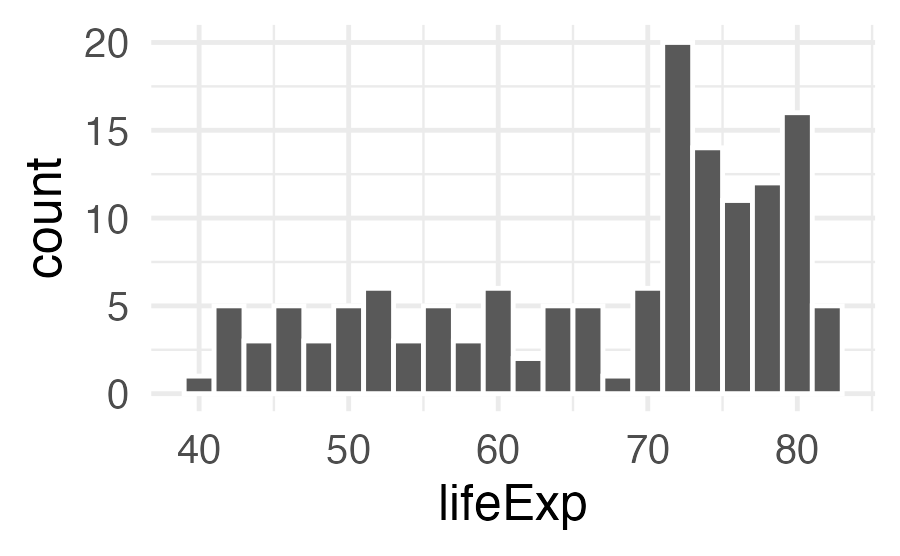
And this!
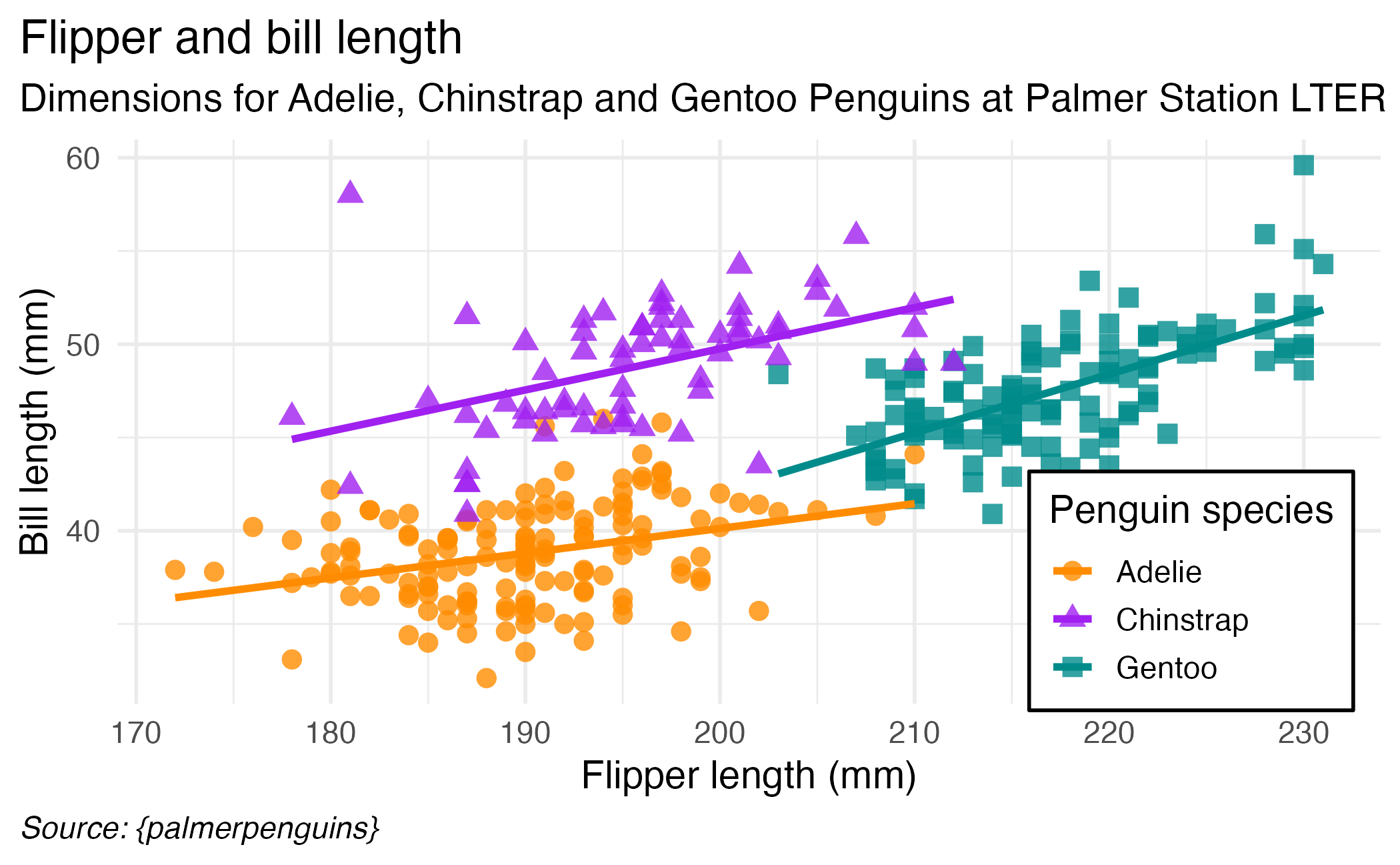
Or this!
Adjusting text size
Adjusting text size

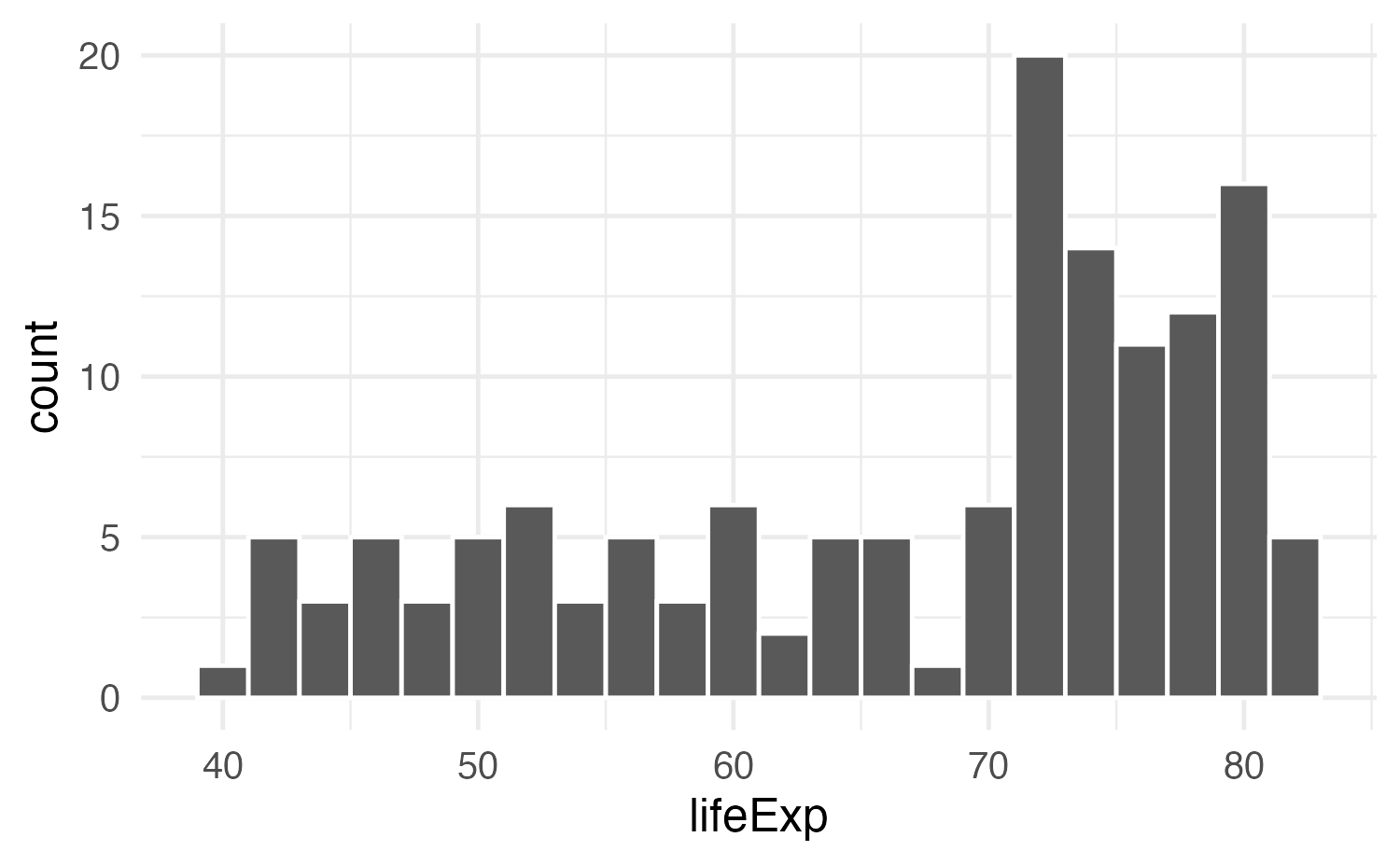
Slide with single plot, little text
The plot will fill the empty space in the slide.
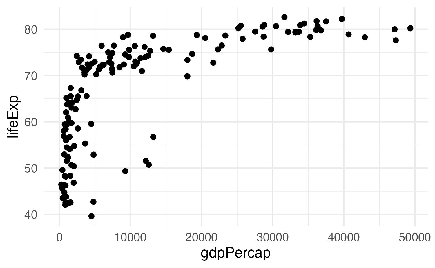
Slide with single plot, lots of text
If there is more text on the slide
The plot will shrink
To make room for the text

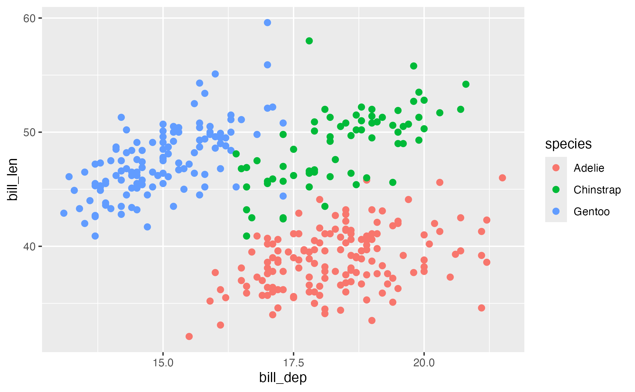
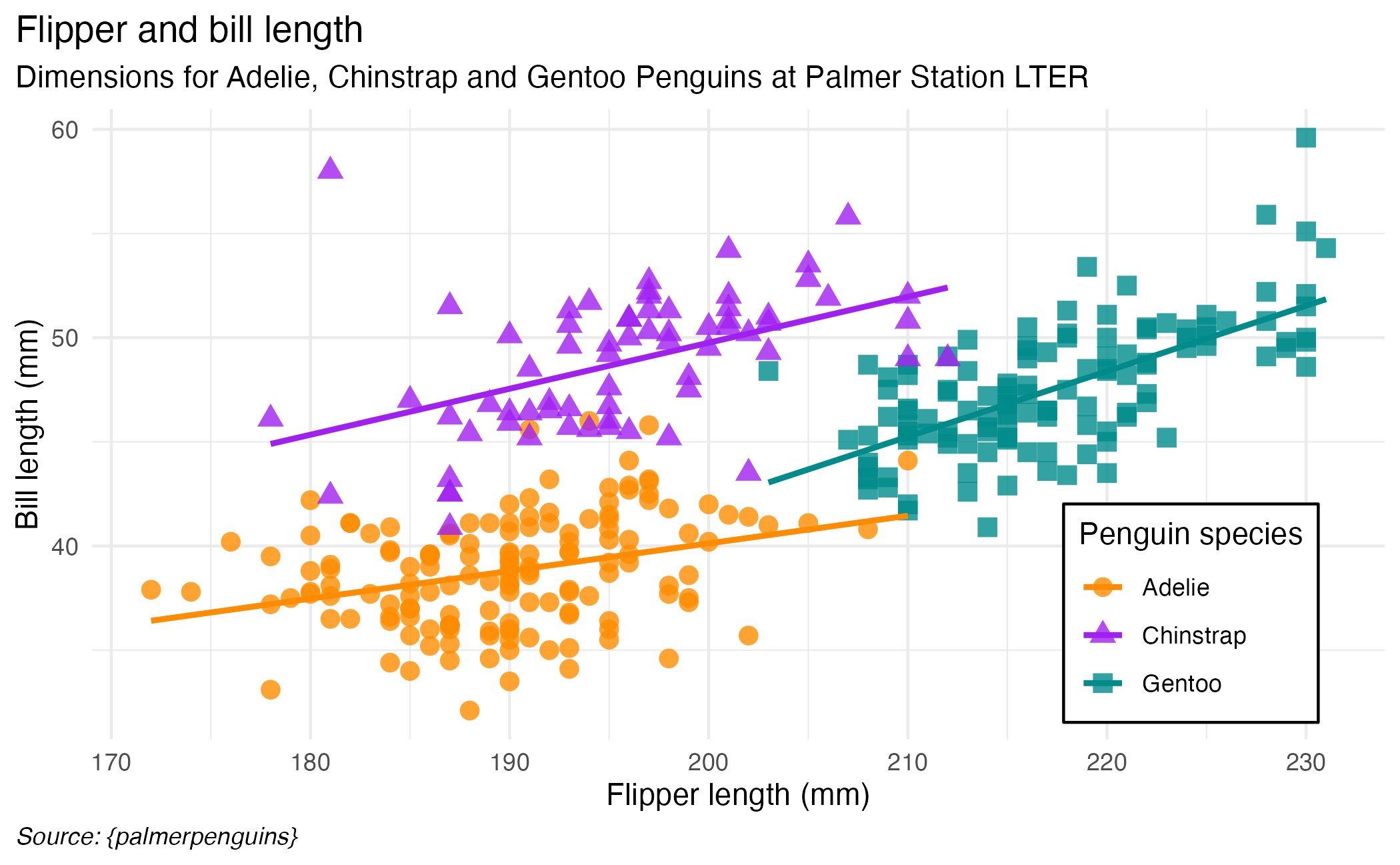
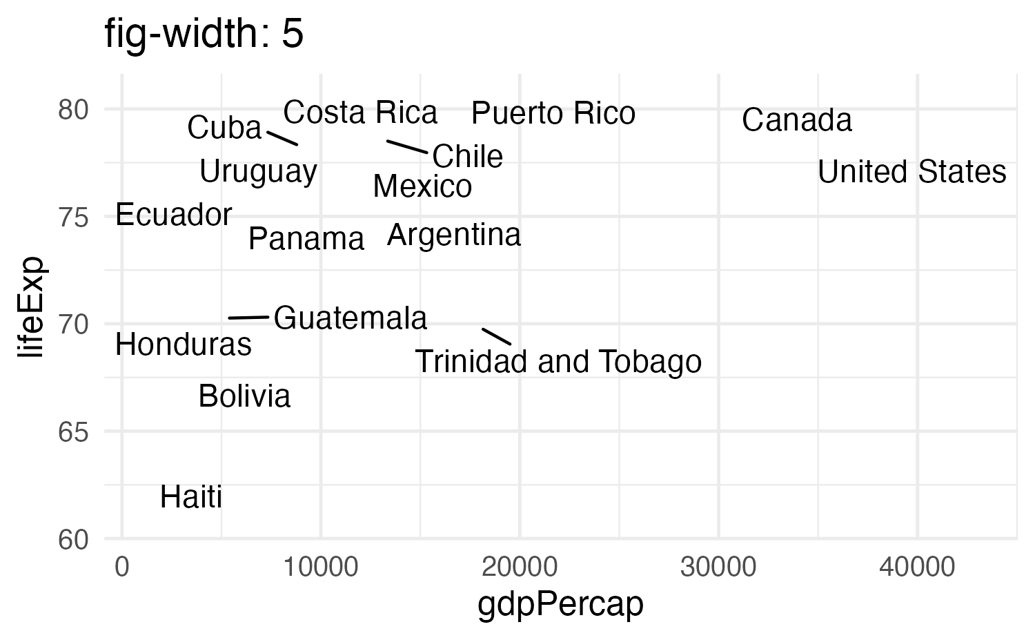
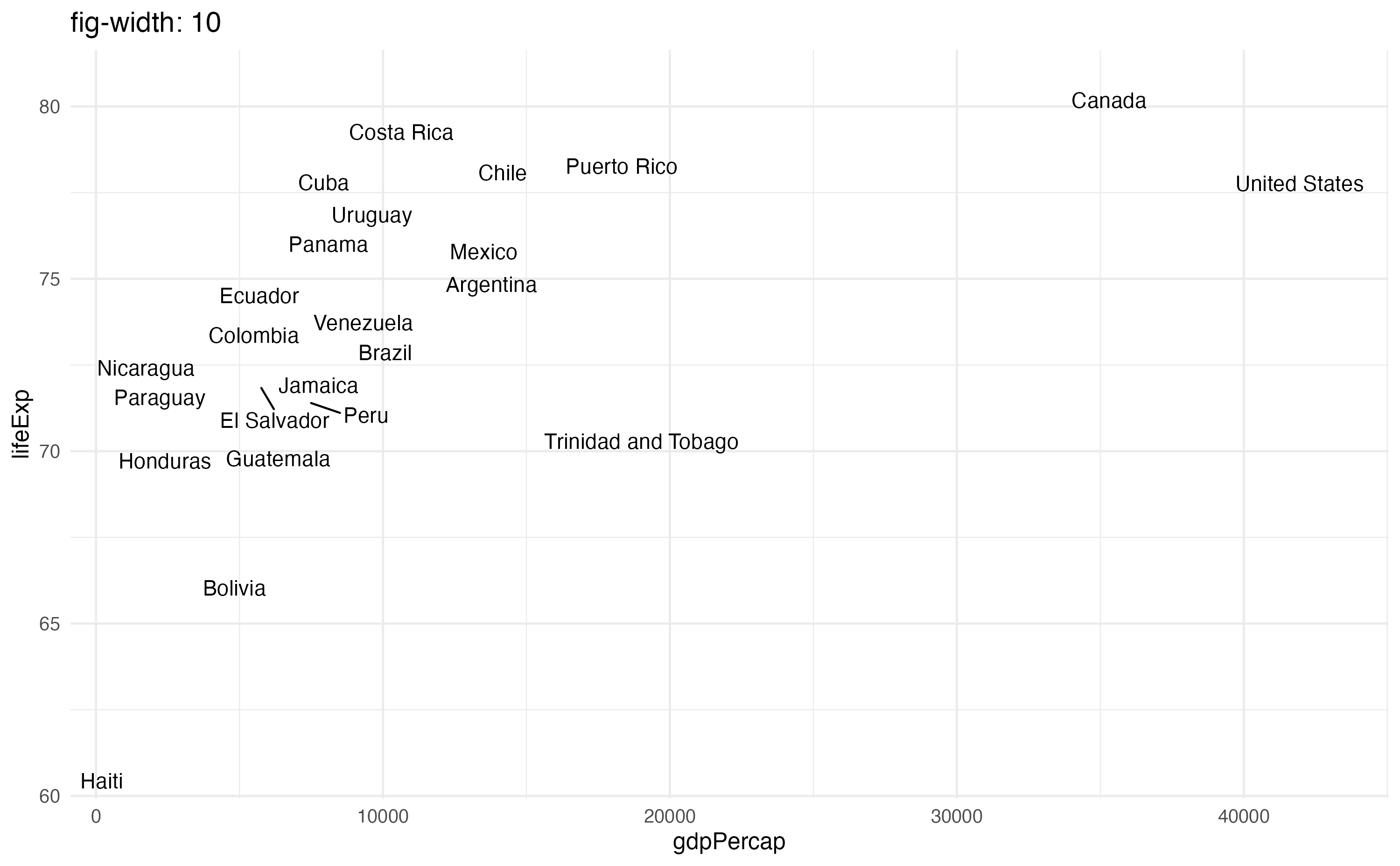
Small fig-width
For a zoomed-in look
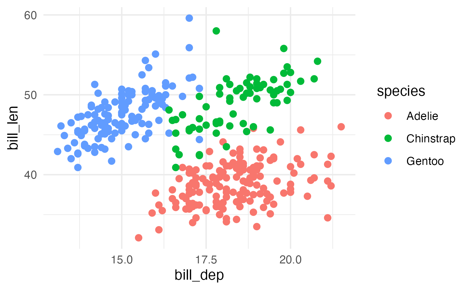
Large fig-width
For a zoomed-out look
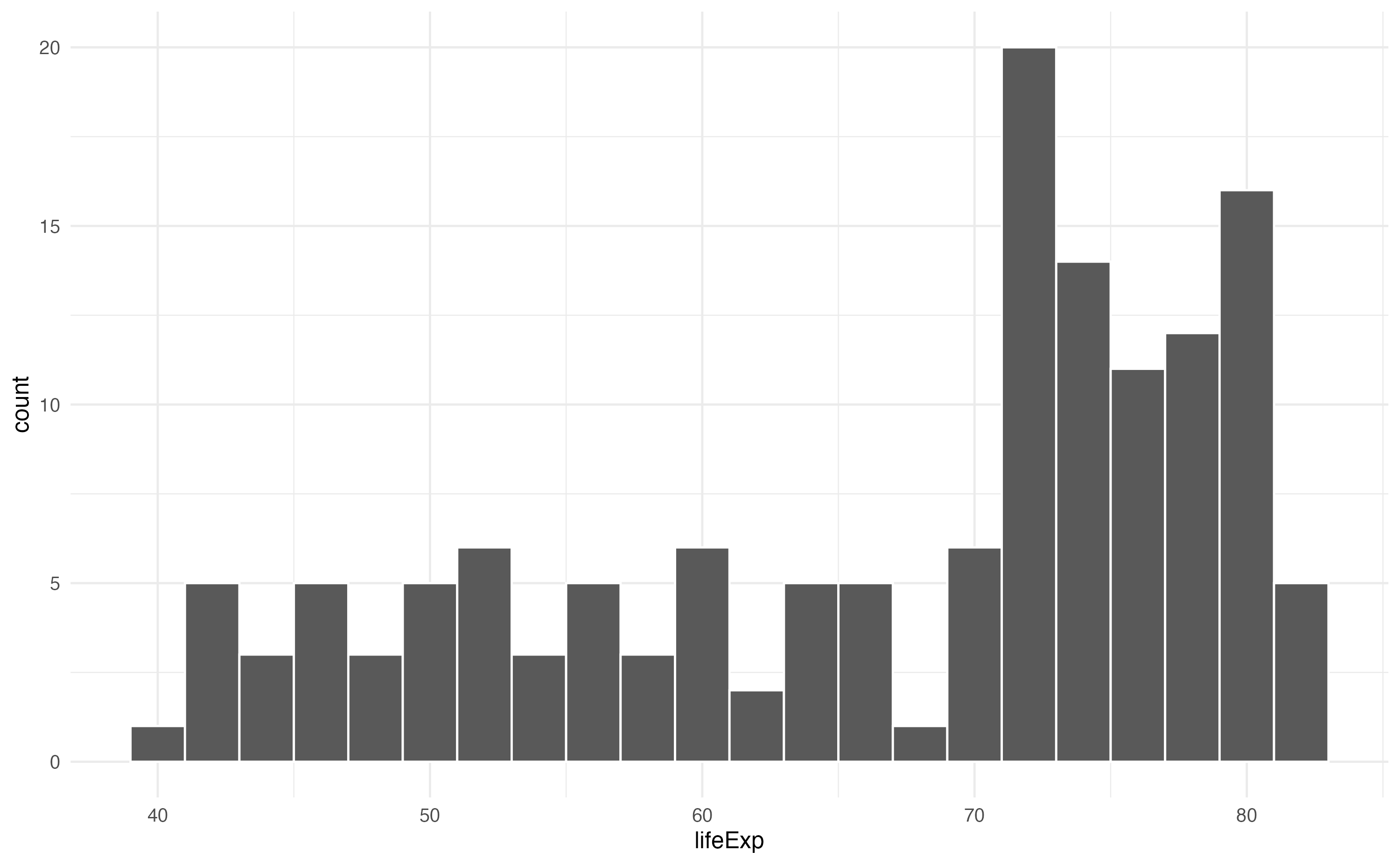
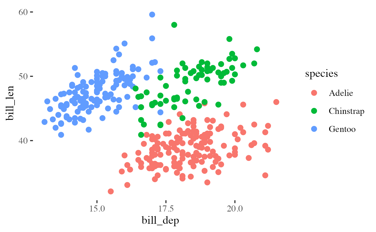
fig-width affects text size
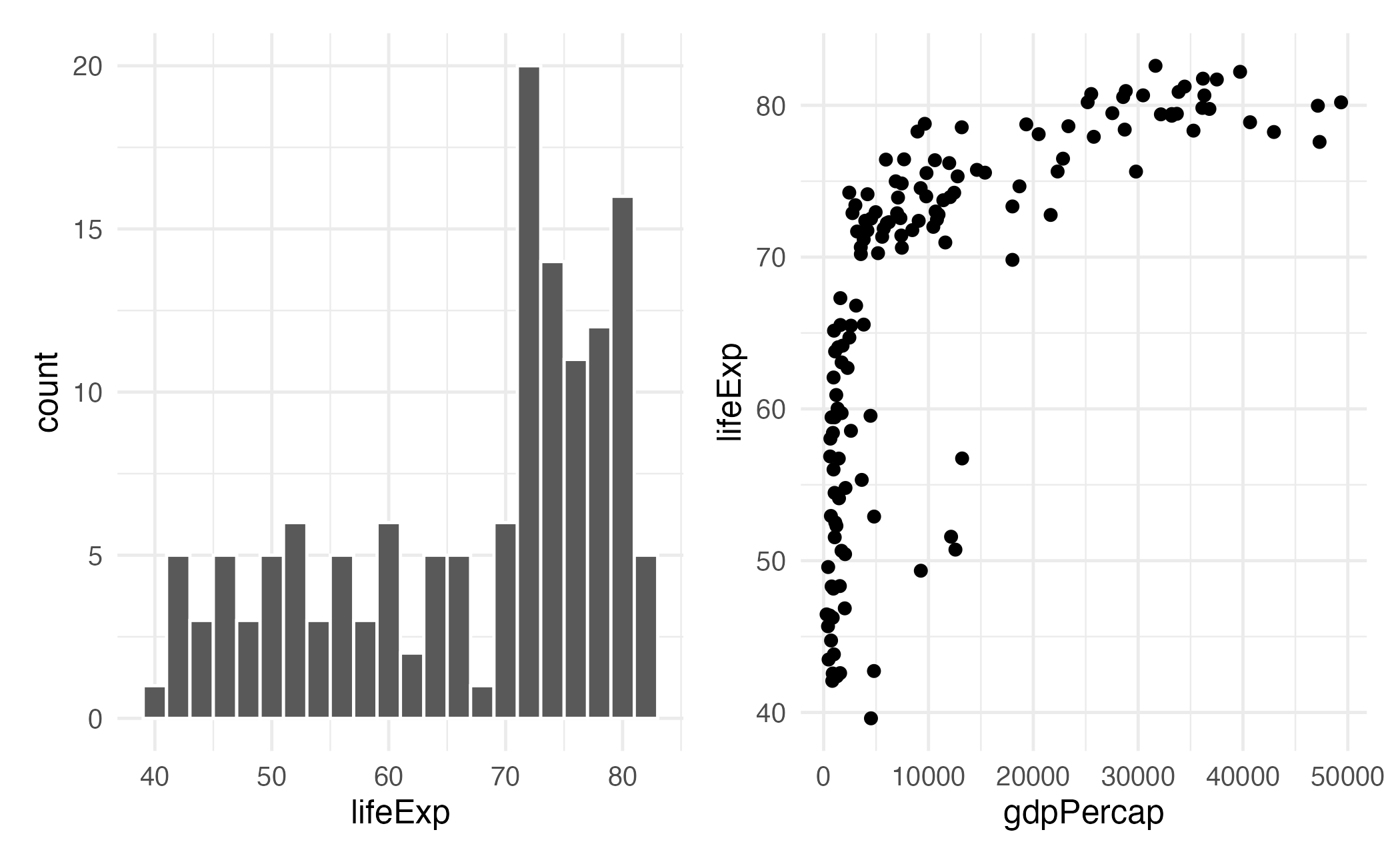
Columns
Insert > Slide Columns
Quarto will automatically resize your plots to fit side-by-side.
layout-ncol


{patchwork}
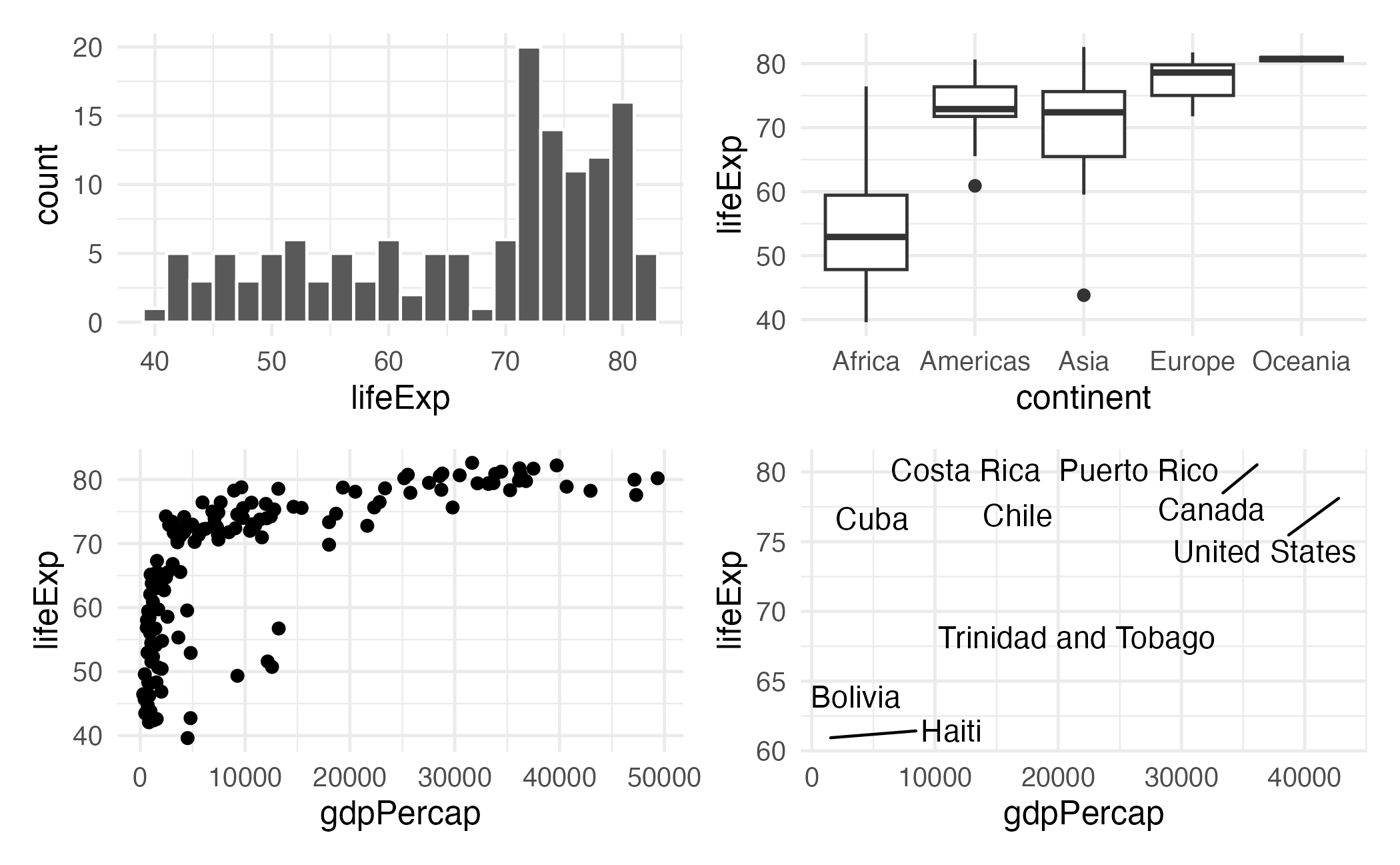
{patchwork} layout I
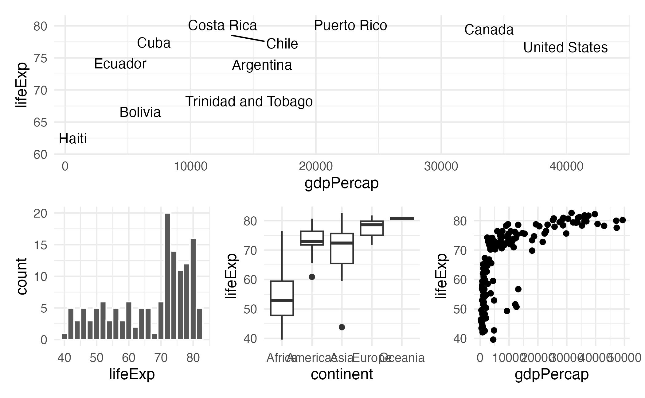
{patchwork} layout II
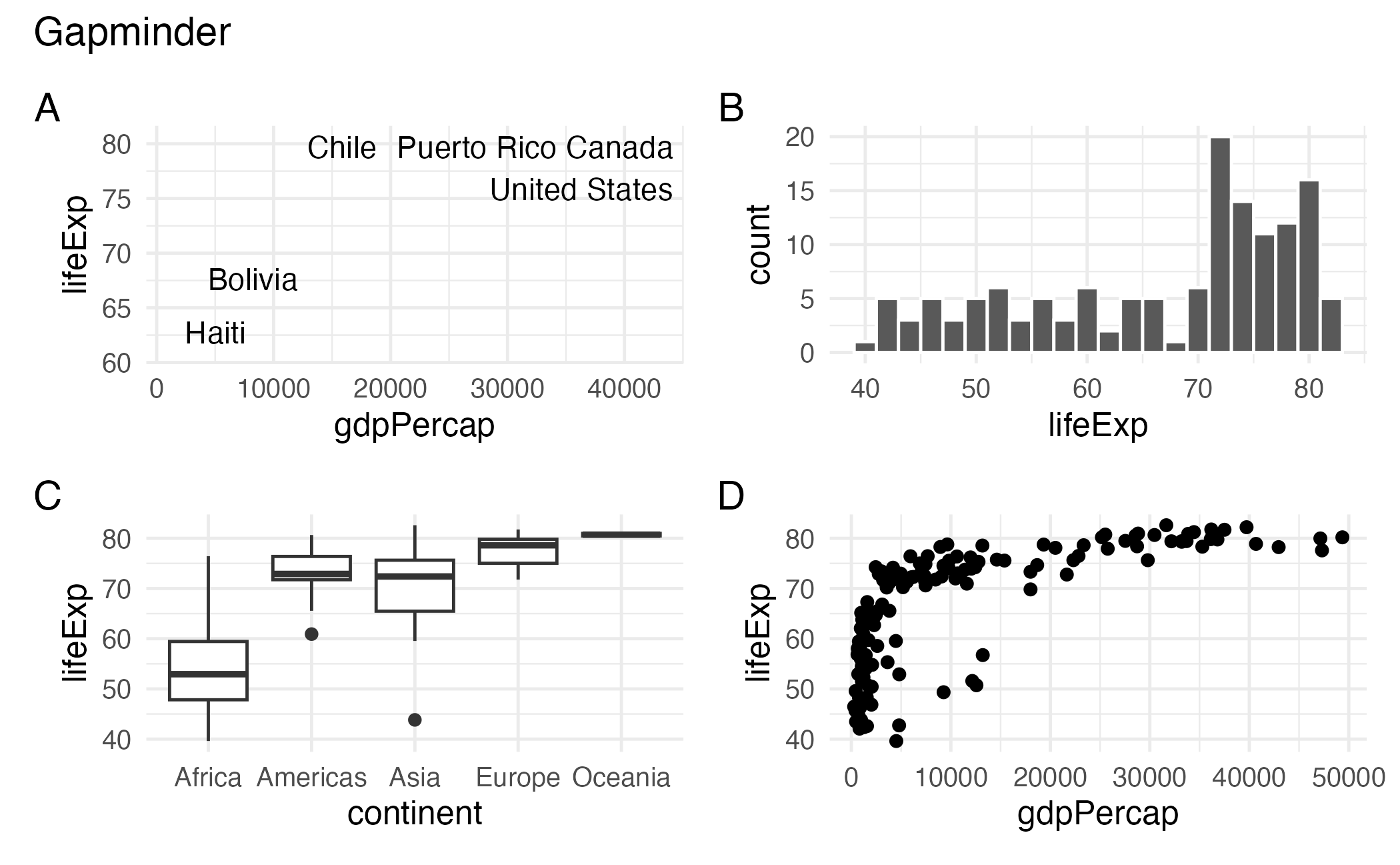
{patchwork} layout III
{patchwork} layout IV