library(tidyverse)
library(readxl)
library(scales)
library(colorblindr)

theme_set(theme_minimal(base_size = 13))Accessible data visualizations
Suggested answers
Application exercise
Answers
Import nursing data
nurses <- read_csv("data/nurses.csv") |> janitor::clean_names()Rows: 1242 Columns: 22
── Column specification ────────────────────────────────────────────────────────
Delimiter: ","
chr (1): State
dbl (21): Year, Total Employed RN, Employed Standard Error (%), Hourly Wage ...
ℹ Use `spec()` to retrieve the full column specification for this data.
ℹ Specify the column types or set `show_col_types = FALSE` to quiet this message.# subset to three states
nurses_subset <- nurses |>
filter(state %in% c("California", "New York", "North Carolina"))
# unemployment data
unemp_state <- read_excel(
path = "data/emp-unemployment.xls",
sheet = "States",
skip = 5
) |>
pivot_longer(
cols = -c(Fips, Area),
names_to = "Year",
values_to = "unemp"
) |>
rename(state = Area, year = Year) |>
mutate(year = parse_number(year)) |>
filter(state != "United States") |>
# calculate mean unemp rate per state and year
group_by(state, year) |>
summarize(unemp_rate = mean(unemp, na.rm = TRUE))`summarise()` has grouped output by 'state'. You can override using the
`.groups` argument.Developing alternative text
Bar chart
Demonstration: The following code chunk demonstrates how to add alternative text to a bar chart. The alternative text is added to the chunk header using the fig-alt chunk option. The text is written in Markdown and can be as long as needed. Note that fig-cap is not the same as fig-alt.
```{r}
#| label: nurses-bar
#| fig-cap: "Total employed Registered Nurses"
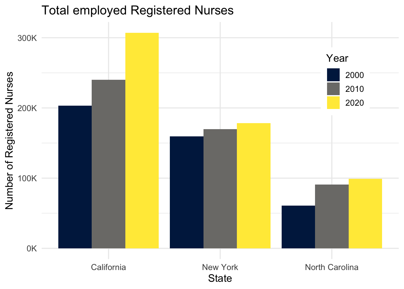
#| fig-alt: "The figure is a bar chart titled 'Total employed Registered
#| Nurses' that displays the numbers of registered nurses in three states
#| (California, New York, and North Carolina) over a 20 year period, with data
#| recorded in three time points (2000, 2010, and 2020). In each state, the
#| numbers of registered nurses increase over time. The following numbers are
#| all approximate. California started off with 200K registered nurses in 2000,
#| 240K in 2010, and 300K in 2020. New York had 150K in 2000, 160K in 2010, and
#| 170K in 2020. Finally North Carolina had 60K in 2000, 90K in 2010, and 100K
#| in 2020."
nurses_subset |>
filter(year %in% c(2000, 2010, 2020)) |>
ggplot(aes(x = state, y = total_employed_rn, fill = factor(year))) +
geom_col(position = "dodge") +
scale_fill_viridis_d(option = "E") +
scale_y_continuous(labels = label_number(scale = 1/1000, suffix = "K")) +
labs(
x = "State", y = "Number of Registered Nurses", fill = "Year",
title = "Total employed Registered Nurses"
) +
theme(
legend.background = element_rect(fill = "white", color = "white"),
legend.position = c(0.85, 0.75)
)
```
Line chart
Your turn: Add alternative text to the following line chart.
```{r}
#| label: nurses-line
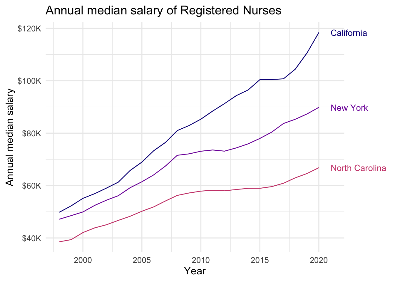
#| fig-alt: 'The figure is titled "Annual median salary of Registered Nurses".
#| There are three lines on the plot: the top labelled California, the middle
#| New York, the bottom North Carolina. The vertical axis is labelled "Annual
#| median salary", beginning with $40K, up to $120K. The horizontal axis is
#| labelled "Year", beginning with couple years before 2000 up to 2020. The
#| following numbers are all approximate. In the graph, the California line
#| begins around $50K in 1998 and goes up to $120K in 2020. The increase is
#| steady, except for stalling for about couple years between 2015 to 2017.
#| The New York line also starts around $50K, just below where the California
#| line starts, and steadily goes up to $90K. And the North Carolina line starts
#| around $40K and steadily goes up to $70K.'
nurses_subset |>
ggplot(aes(x = year, y = annual_salary_median, color = state)) +
geom_line(show.legend = FALSE) +
geom_text(
data = nurses_subset |> filter(year == max(year)),
aes(label = state), hjust = 0, nudge_x = 1,
show.legend = FALSE
) +
scale_color_viridis_d(option = "C", end = 0.5) +
scale_y_continuous(labels = label_dollar(scale = 1/1000, suffix = "K")) +
labs(
x = "Year", y = "Annual median salary", color = "State",
title = "Annual median salary of Registered Nurses"
) +
coord_cartesian(clip = "off") +
theme(
plot.margin = margin(0.1, 0.9, 0.1, 0.1, "in")
)
```
Scatterplot
Your turn: Add alternative text to the following scatterplot.
```{r}
#| label: nurses-scatter
#| fig-alt: 'The figure is titled "Median hourly wage of Registered Nurses".
#| It is a scatter plot with points for each of the 50 U.S. states from 1998
#| to 2008. The horizontal axis is labeled "Unemployment rate", beginning
#| around 2% up to 14%. The horizontal axis is labelled "Median hourly wage",
#| beginning with amounts under $20 up to approximately $50. The pattern is
#| hard to discern but appears to show a positive correlation between the
#| variables. As unemployment rate increases the median hourly wage also
#| slightly increases. There is more variability in median hourly wage for
#| unemployment rates below 7%.'

nurses |>
  left_join(unemp_state) |>
  drop_na(unemp_rate) |>
  ggplot(aes(x = unemp_rate, y = hourly_wage_median)) +
  geom_point(size = 2, alpha = .5) +
  scale_x_continuous(labels = label_percent(scale = 1)) +
  scale_y_continuous(labels = label_dollar()) +
  labs(
    x = "Unemployment rate", y = "Median hourly wage",
    title = "Median hourly wage of Registered Nurses (1998-2018)",
    subtitle = "By state"
  )
```
Joining with `by = join_by(state, year)`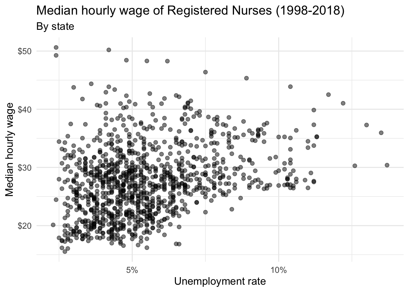
Acknowledgments
- Exercise drawn from STA 313: Advanced Data Visualization
Session information
sessioninfo::session_info()─ Session info ───────────────────────────────────────────────────────────────
setting value
version R version 4.3.1 (2023-06-16)
os macOS Ventura 13.5.2
system aarch64, darwin20
ui X11
language (EN)
collate en_US.UTF-8
ctype en_US.UTF-8
tz America/New_York
date 2023-11-28
pandoc 3.1.1 @ /Applications/RStudio.app/Contents/Resources/app/quarto/bin/tools/ (via rmarkdown)
─ Packages ───────────────────────────────────────────────────────────────────
package * version date (UTC) lib source
bit 4.0.5 2022-11-15 [1] CRAN (R 4.3.0)
bit64 4.0.5 2020-08-30 [1] CRAN (R 4.3.0)
cellranger 1.1.0 2016-07-27 [1] CRAN (R 4.3.0)
cli 3.6.1 2023-03-23 [1] CRAN (R 4.3.0)
colorblindr * 0.1.0 2023-06-19 [1] Github (clauswilke/colorblindr@e6730be)
colorspace * 2.1-0 2023-01-23 [1] CRAN (R 4.3.0)
crayon 1.5.2 2022-09-29 [1] CRAN (R 4.3.0)
digest 0.6.33 2023-07-07 [1] CRAN (R 4.3.0)
dplyr * 1.1.3 2023-09-03 [1] CRAN (R 4.3.0)
evaluate 0.22 2023-09-29 [1] CRAN (R 4.3.1)
fansi 1.0.5 2023-10-08 [1] CRAN (R 4.3.1)
farver 2.1.1 2022-07-06 [1] CRAN (R 4.3.0)
fastmap 1.1.1 2023-02-24 [1] CRAN (R 4.3.0)
forcats * 1.0.0 2023-01-29 [1] CRAN (R 4.3.0)
generics 0.1.3 2022-07-05 [1] CRAN (R 4.3.0)
ggplot2 * 3.4.2 2023-04-03 [1] CRAN (R 4.3.0)
glue 1.6.2 2022-02-24 [1] CRAN (R 4.3.0)
gtable 0.3.3 2023-03-21 [1] CRAN (R 4.3.0)
here 1.0.1 2020-12-13 [1] CRAN (R 4.3.0)
hms 1.1.3 2023-03-21 [1] CRAN (R 4.3.0)
htmltools 0.5.6.1 2023-10-06 [1] CRAN (R 4.3.1)
htmlwidgets 1.6.2 2023-03-17 [1] CRAN (R 4.3.0)
janitor 2.2.0 2023-02-02 [1] CRAN (R 4.3.0)
jsonlite 1.8.7 2023-06-29 [1] CRAN (R 4.3.0)
knitr 1.44 2023-09-11 [1] CRAN (R 4.3.0)
labeling 0.4.2 2020-10-20 [1] CRAN (R 4.3.0)
lifecycle 1.0.3 2022-10-07 [1] CRAN (R 4.3.0)
lubridate * 1.9.3 2023-09-27 [1] CRAN (R 4.3.1)
magrittr 2.0.3 2022-03-30 [1] CRAN (R 4.3.0)
munsell 0.5.0 2018-06-12 [1] CRAN (R 4.3.0)
pillar 1.9.0 2023-03-22 [1] CRAN (R 4.3.0)
pkgconfig 2.0.3 2019-09-22 [1] CRAN (R 4.3.0)
purrr * 1.0.2 2023-08-10 [1] CRAN (R 4.3.0)
R6 2.5.1 2021-08-19 [1] CRAN (R 4.3.0)
readr * 2.1.4 2023-02-10 [1] CRAN (R 4.3.0)
readxl * 1.4.2 2023-02-09 [1] CRAN (R 4.3.0)
rlang 1.1.1 2023-04-28 [1] CRAN (R 4.3.0)
rmarkdown 2.25 2023-09-18 [1] CRAN (R 4.3.1)
rprojroot 2.0.3 2022-04-02 [1] CRAN (R 4.3.0)
rstudioapi 0.14 2022-08-22 [1] CRAN (R 4.3.0)
scales * 1.2.1 2022-08-20 [1] CRAN (R 4.3.0)
sessioninfo 1.2.2 2021-12-06 [1] CRAN (R 4.3.0)
snakecase 0.11.0 2019-05-25 [1] CRAN (R 4.3.0)
stringi 1.7.12 2023-01-11 [1] CRAN (R 4.3.0)
stringr * 1.5.0 2022-12-02 [1] CRAN (R 4.3.0)
tibble * 3.2.1 2023-03-20 [1] CRAN (R 4.3.0)
tidyr * 1.3.0 2023-01-24 [1] CRAN (R 4.3.0)
tidyselect 1.2.0 2022-10-10 [1] CRAN (R 4.3.0)
tidyverse * 2.0.0 2023-02-22 [1] CRAN (R 4.3.0)
timechange 0.2.0 2023-01-11 [1] CRAN (R 4.3.0)
tzdb 0.4.0 2023-05-12 [1] CRAN (R 4.3.0)
utf8 1.2.4 2023-10-22 [1] CRAN (R 4.3.1)
vctrs 0.6.4 2023-10-12 [1] CRAN (R 4.3.1)
viridisLite 0.4.2 2023-05-02 [1] CRAN (R 4.3.0)
vroom 1.6.3 2023-04-28 [1] CRAN (R 4.3.0)
withr 2.5.2 2023-10-30 [1] CRAN (R 4.3.1)
xfun 0.40 2023-08-09 [1] CRAN (R 4.3.0)
yaml 2.3.7 2023-01-23 [1] CRAN (R 4.3.0)
[1] /Library/Frameworks/R.framework/Versions/4.3-arm64/Resources/library
──────────────────────────────────────────────────────────────────────────────