HW 04 - Analyze socioeconomic data for countries
This homework is due October 8 at 11:59pm ET.
Learning objectives
- Import and clean untidy data from multiple files
- Write functions for data cleaning
- Implement iterative operations
- Create effective data visualizations
Getting started
Go to the info5001-fa25 organization on GitHub. Click on the repo with the prefix hw-04. It contains the starter documents you need to complete the homework.
Clone the repo and start a new workspace in Positron. See the Homework 0 instructions for details on cloning a repo and starting a new R project.
General guidance
As we’ve discussed in lecture, your plots should include an informative title, axes should be labeled, and careful consideration should be given to aesthetic choices.
Remember that continuing to develop a sound workflow for reproducible data analysis is important as you complete the lab and other assignments in this course. There will be periodic reminders in this assignment to remind you to render, commit, and push your changes to GitHub. You should have at least 3 commits with meaningful commit messages by the end of the assignment.
Make sure to
- Update author name on your document.
- Label all code chunks informatively and concisely.
- Follow the Tidyverse code style guidelines.
- Make at least 3 commits.
- Resize figures where needed, avoid tiny or huge plots.
- Turn in an organized, well formatted document.
Packages
We’ll use the {tidyverse} for much of the data wrangling and visualization and {readxl} for importing Excel spreadsheets, as well as {scales} for formatting axes and {colorblindr} for additional color palettes.
Data
The World Bank publishes extensive socioeconomic data on countries/economies around the world. The data_world_bank folder contains the World Bank’s complete economic indicators for each country in their database.1
Exercises
Exercise 1
Import and tidy the data files. The data files are stored in the data/world_bank folder. Each file contains data for a single country. You need to import all the data files and combine them into a single tidy data frame.
- I highly recommend you examine the structure of one of the Excel files interactively using a spreadsheet application. This will help you understand the structure of the data and how to import it.
- Refer back to what you have learned so far about functions and iterative operations in R.
- You will have a substantial amount of data wrangling to perform in order to get the data set into a tidy structure.
- Your final data frame should have one row for each country for each year. The expected dimensions are 14,105 rows and 1,518 columns.
Exercise 2
Use the World Bank Open Data portal to find the appropriate indicators in your data frame for the remaining exercises.
How has child mortality changed globally over time? Construct a line graph reporting changes in the mortality rate, under-5 (per 1,000 live births). The graph should incorporate a single line for each country, as well as an overall trend line globally.
Exercise 3
How has inequality changed globally?2 The Gini index is a measure of wealth inequality. It ranges from 0 (perfect equality) to 100 (complete inequality). We are interested in how it has changed within countries from 2010 to 2020.
Reproduce the following graph using your tidied data frame.

The {colorblindr} package provides a set of color palettes designed to be colorblind-friendly. The scale_color_OkabeIto() function provides the colorblind-friendly palette used in this graph.
Exercise 4
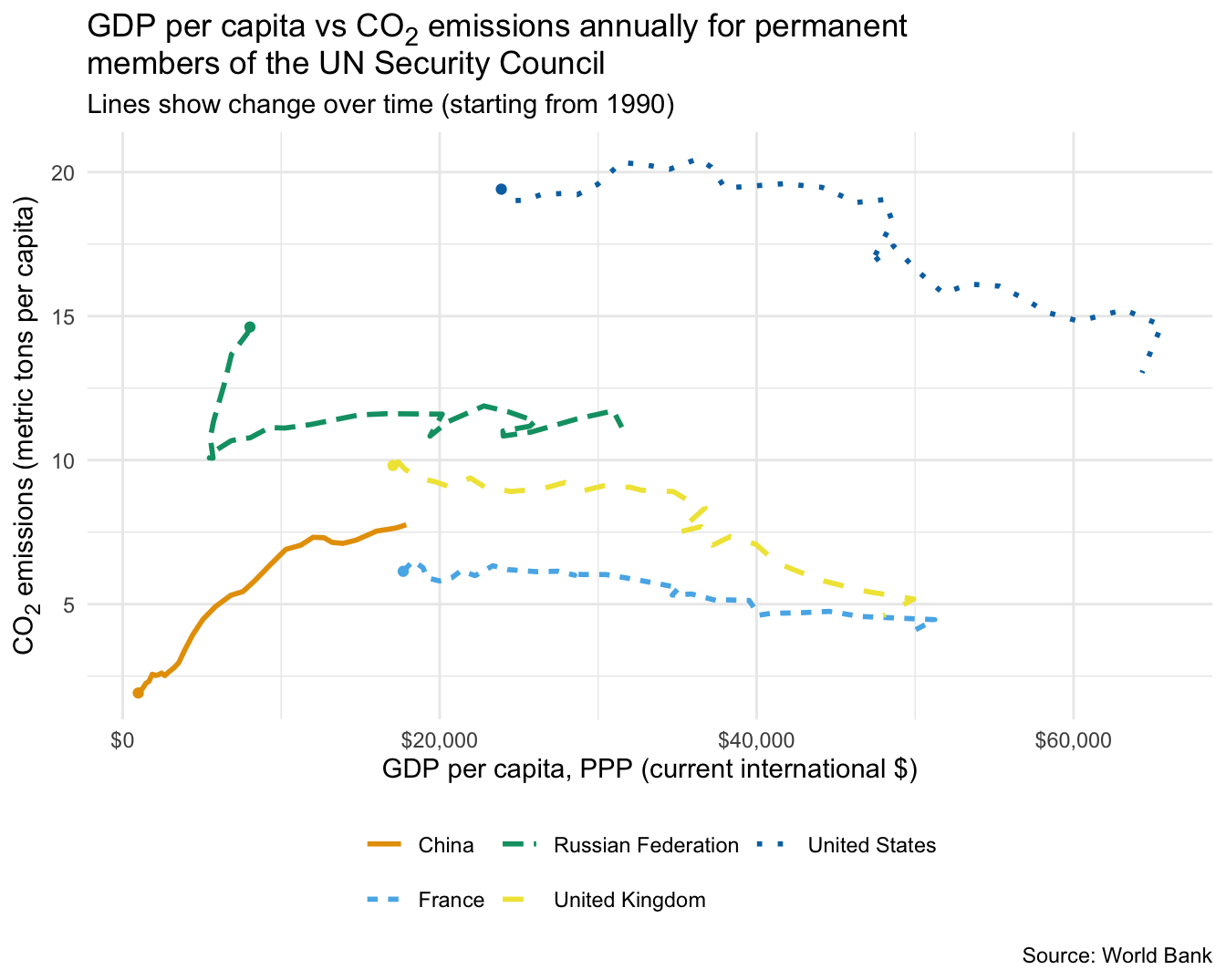
How does economic activity correlate with CO2 emissions over time for permanent members of the UN Security Council? The UN Security Council is composed of five permanent members: China, France, Russia, the United Kingdom, and the United States. We are interested in how economic activity (GDP) correlates with CO2 emissions over time for these countries.
To visualize these trends, we will do something a bit different. Typically we encode time on the \(x\)-axis and a response variable on the \(y\)-axis. For this exercise, we want to encode GDP on the \(x\)-axis and CO2 emissions on the \(y\)-axis, connecting each country’s data points chronologically with a line. This will allow us to see how the relationship between GDP and CO2 emissions has changed over time for each of the five countries.
The chart below provides a useful reference.
Wrap up
Submission
- Go to http://www.gradescope.com and click Log in in the top right corner.
- Click School Credentials \(\rightarrow\) Cornell University NetID and log in using your NetID credentials.
- Click on your INFO 5001 course.
- Click on the assignment, and you’ll be prompted to submit it.
- Mark all the pages associated with exercise. All the pages of your homework should be associated with at least one question (i.e., should be “checked”).
- Select all pages of your .pdf submission to be associated with the “Workflow & formatting” question.
Grading
- Exercise 1: 20 points
- Exercise 2: 5 points
- Exercise 3: 10 points
- Exercise 4: 10 points
- Workflow + formatting: 5 points
- Total: 50 points
The “Workflow & formatting” component assesses the reproducible workflow. This includes:
- At least 3 informative commit messages
- Following {tidyverse} code style
- All code being visible in rendered PDF without automatic wrapping (no more than 80 characters)
Footnotes
In this context the term country, used interchangeably with economy, does not imply political independence but refers to any territory for which authorities report separate social or economic statistics. Hence you will find in this data 189 World Bank member countries along with other “countries” with populations of more than 30,000 people.↩︎
This exercise is inspired by the Key Inequality Indicators dashboard↩︎