HW 05 - Law and courts
This homework is due October 22 at 11:59pm ET.
Learning objectives
- Scrape data from the web
- Clean and tidy data
- Create visualizations to explore and communicate findings from data
- Write functions to automate repetitive tasks
Getting started
Go to the info5001-fa25 organization on GitHub. Click on the repo with the prefix hw-05. It contains the starter documents you need to complete the homework.
Clone the repo and start a new workspace in Positron. See the Homework 0 instructions for details on cloning a repo and starting a new R project.
General guidance
As we’ve discussed in lecture, your plots should include an informative title, axes should be labeled, and careful consideration should be given to aesthetic choices.
Remember that continuing to develop a sound workflow for reproducible data analysis is important as you complete the lab and other assignments in this course. There will be periodic reminders in this assignment to remind you to render, commit, and push your changes to GitHub. You should have at least 3 commits with meaningful commit messages by the end of the assignment.
Make sure to
- Update author name on your document.
- Label all code chunks informatively and concisely.
- Follow the Tidyverse code style guidelines.
- Make at least 3 commits.
- Resize figures where needed, avoid tiny or huge plots.
- Turn in an organized, well formatted document.
Packages
We’ll use the {tidyverse} package for much of the data wrangling and visualization, {rvest} for web scraping, and the {scales} package for better formatting of labels on visualizations. You are welcome to load additional packages as necessary.
Assessing policy impact of prison phone rate regulations
The Prison Policy Initiative is a non-profit organization that conducts research and advocacy on mass incarceration. In 2022 they released a report on the cost of phone calls from prisons and jails in the United States. The report found that the cost of phone calls from prisons and jails is unreasonably high, and that the high cost of calls is a barrier to maintaining family connections and successful reentry after release.
Appendix table 1 of the report contains phone call rates in state prisons over time.
Exercise 1
What impact did the FCC regulations have on out-of-state phone rates? In 2014, the Federal Communications Commission adopted regulations to cap the cost of phone calls from prisons and jails, successfully imposing caps on out-of-state phone rates. Scrape Appendix table 1 and reproduce the visualization below to report on the impact of this regulation on state prison out-of-state phone rates. The visualization should show the average cost of a 15-minute phone call from state prisons to out-of-state numbers over time. The dashed line should indicate the year 2014, when the FCC regulations were adopted.
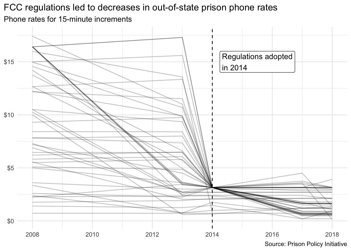
- This exercise is intended, in part, to assess your troubleshooting skills and ability to utilize reference documentation to accomplish tasks.
Analyzing U.S. Supreme Court decision making
The Supreme Court Database contains detailed information of every published decision of the U.S. Supreme Court since its creation in 1791. It is perhaps the most utilized database in the study of judicial politics.
In the repository’s data folder, you will find two data files:
scdb-case.csvscdb-vote.csv
These contain the exact same data you would obtain if you downloaded the files from the original website, but reformatted to be stored as relational data files. That is, scdb-case.csv contains all case-level variables, whereas scdb-vote.csv contains all vote-level variables.
The data is structured in a tidy fashion.
-
scdb-case.csvcontains one row for every case and one column for every variable -
scdb-vote.csvcontains one row for every vote by a justice in every case and one column for every variable
The current dataset contains information on every case decided from the 1791-2024 terms.1 There are several ID variables which can be used to join the data frames, specifically caseId, docketId, caseIssuesId, and term. Other variables you will want to familiarize yourself with include:
dateDecisiondecisionTypedeclarationUncondirectionissueAreajusticejusticeNamemajoritymajVotesminVotesterm
Each variable above is linked to the relevant documentation page in the online code book. In addition, a PDF copy of the entire documentation is located in the data folder.
Once you import the data files, use your data wrangling and visualization skills to answer the following exercises.
Pay careful attention to the unit of analysis required to answer each question. Some questions only require case-level variables, others only require vote-level variables, and some may require combining the two data frames together. Be sure to choose an appropriate relational join function as necessary.
Exercise 2
How does the percentage of cases in each term that are decided by a one-vote margin (i.e. 5-4, 4-3, etc.) change over time? Generate an appropriate visualization, then provide a brief (no more than one paragraph) answer to the question. Utilize your graph to support your answer.
- The Supreme Court has decided cases in virtually every term since its creation in 1791. Your graph should not have any gaps or jumps between non-contiguous terms on the
termaxis.
Exercise 3
For justices currently serving on the Supreme Court, how often have they voted in the conservative direction in cases involving criminal procedure, civil rights, economic activity, and judicial power? Generate an appropriate visualization that allows the reader to make comparisons across justices and categories, then provide a brief (no more than one paragraph) answer to the question. Utilize your graph to support your answer.
- The Supreme Court’s website maintains a list of active members of the Court. Retired justices should not be included in your analysis.
- Rather than ordering the justices alphabetically, it would make sense to organize the resulting graph by justice in descending order of seniority. Seniority is based on when a justice is appointed to the Court, so the justice who has served the longest is the most “senior” justice.
- Note that by rule and tradition, the Chief Justice is always considered the most senior member of the court, regardless of appointment date.
Exercise 4
How many decisions are typically announced in a given calendar month? For each term and month, determine the number of decisions (decided after oral arguments) that were announced, then generate an appropriate visualization so that you can identify the overall trend as well as any outliers. Finally, provide a brief (no more than one paragraph) answer to the question. Utilize your graph to support your answer.
- Most, but not all, of the Court’s decisions are published following a set of oral arguments. One of the variables in the dataset indicates how the Court arrived at its decision. Any case which is explicitly labeled as “orally argued” should be included on this graph.
- Ensure your summarized data is complete. That is, you should have a single numeric value (the number of decisions announced) for each term for each calendar month. If you do this properly, you should have a data frame with 2,772 rows.
- The Supreme Court’s calendar runs on the federal government’s fiscal year. That means the first month of the court’s term is October, running through September of the following calendar year.
Exercise 5
How often are justices in the ruling majority? Write a function to create a single visualization for an individual justice that shows the percentage of cases in which they were in the majority annually for all decisions and non-unanimous decisions (e.g. at least one justice disagreed with the decision).
Generate visualizations for Antonin Scalia and at least two other Supreme Court justices, then provide a brief (no more than one paragraph) answer to the question as it relates to those justices. Utilize your graphs to support your answer.
- I suggest writing appropriate code that allows you to create this visualization for a single Supreme Court justice. Once you know your code works correctly, then convert it into a function that works for any Supreme Court justice in the database.
- You need to calculate two separate variables (percentage of cases in the majority for all decisions per term, and percentage of cases in the majority for non-unanimous decisions per term). Both are necessary to construct the plot. You could do this in a single data frame or multiple data frames. Likewise, you can construct the plot using a single data frame or multiple data frames.
- Your visualization must be interpretable. This means that you should include appropriate labels, titles, and legends to help the reader understand the data.
Wrap up
Submission
- Go to http://www.gradescope.com and click Log in in the top right corner.
- Click School Credentials \(\rightarrow\) Cornell University NetID and log in using your NetID credentials.
- Click on your INFO 5001 course.
- Click on the assignment, and you’ll be prompted to submit it.
- Mark all the pages associated with exercise. All the pages of your homework should be associated with at least one question (i.e., should be “checked”).
- Select all pages of your .pdf submission to be associated with the “Workflow & formatting” question.
Grading
- Exercise 1: 10 points
- Exercise 2: 6 points
- Exercise 3: 9 points
- Exercise 4: 10 points
- Exercise 5: 10 points
- Workflow + formatting: 5 points
- Total: 50 points
The “Workflow & formatting” component assesses the reproducible workflow. This includes:
- At least 3 informative commit messages
- Following {tidyverse} code style
- All code being visible in rendered PDF without automatic wrapping (no more than 80 characters)
Footnotes
Terms run from October through June, so the 2024 term contains cases decided from October 2024 - September 2025.↩︎