library(tidyverse)
library(readxl)
library(scales)
library(colorblindr)
library(coloratio)

theme_set(theme_minimal(base_size = 13))Accessible data visualizations
Application exercise
Import nursing data
nurses <- read_csv("data/nurses.csv") |> janitor::clean_names()Rows: 1242 Columns: 22
── Column specification ────────────────────────────────────────────────────────
Delimiter: ","
chr (1): State
dbl (21): Year, Total Employed RN, Employed Standard Error (%), Hourly Wage ...
ℹ Use `spec()` to retrieve the full column specification for this data.
ℹ Specify the column types or set `show_col_types = FALSE` to quiet this message.# subset to three states
nurses_subset <- nurses |>
filter(state %in% c("California", "New York", "North Carolina"))
# unemployment data
unemp_state <- read_excel(
path = "data/emp-unemployment.xls",
sheet = "States",
skip = 5
) |>
pivot_longer(
cols = -c(Fips, Area),
names_to = "Year",
values_to = "unemp"
) |>
rename(state = Area, year = Year) |>
mutate(year = parse_number(year)) |>
filter(state != "United States") |>
# calculate mean unemp rate per state and year
group_by(state, year) |>
summarize(unemp_rate = mean(unemp, na.rm = TRUE))`summarise()` has grouped output by 'state'. You can override using the
`.groups` argument.Developing alternative text
Bar chart
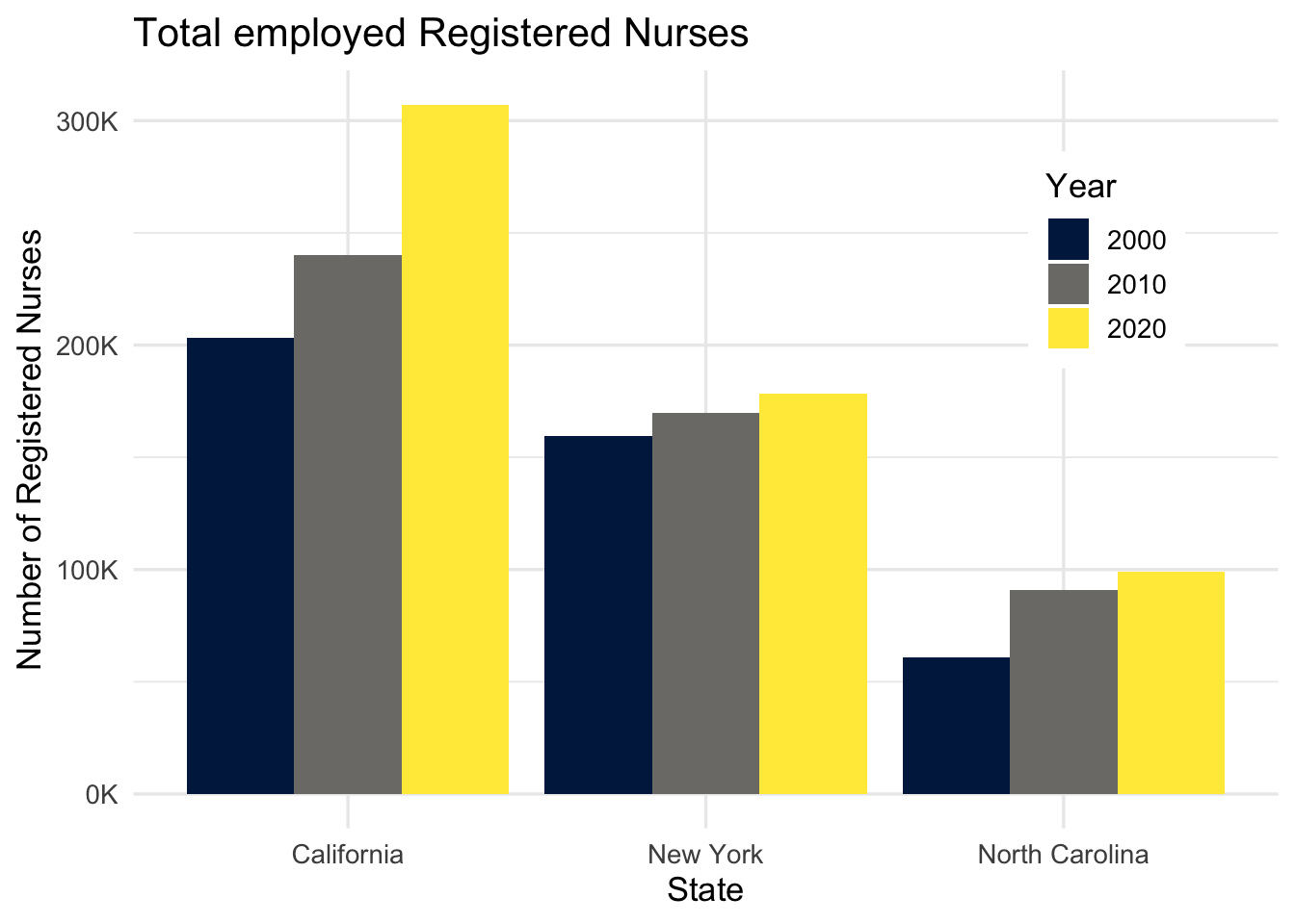
Demonstration: The following code chunk demonstrates how to add alternative text to a bar chart. The alternative text is added to the chunk header using the fig-alt chunk option. The text is written in Markdown and can be as long as needed. Note that fig-cap is not the same as fig-alt.
```{r}
#| label: nurses-bar
#| fig-cap: "Total employed Registered Nurses"
#| fig-alt: "The figure is a bar chart titled 'Total employed Registered
#| Nurses' that displays the numbers of registered nurses in three states
#| (California, New York, and North Carolina) over a 20 year period, with data
#| recorded in three time points (2000, 2010, and 2020). In each state, the
#| numbers of registered nurses increase over time. The following numbers are
#| all approximate. California started off with 200K registered nurses in 2000,
#| 240K in 2010, and 300K in 2020. New York had 150K in 2000, 160K in 2010, and
#| 170K in 2020. Finally North Carolina had 60K in 2000, 90K in 2010, and 100K
#| in 2020."

nurses_subset |>
  filter(year %in% c(2000, 2010, 2020)) |>
  ggplot(aes(x = state, y = total_employed_rn, fill = factor(year))) +
  geom_col(position = "dodge") +
  scale_fill_viridis_d(option = "E") +
  scale_y_continuous(labels = label_number(scale = 1/1000, suffix = "K")) +
  labs(
    x = "State", y = "Number of Registered Nurses", fill = "Year",
    title = "Total employed Registered Nurses"
  ) +
  theme(
    legend.background = element_rect(fill = "white", color = "white"),
    legend.position = c(0.85, 0.75)
    )
```
Line chart
Your turn: Add alternative text to the following line chart.
nurses_subset |>
  ggplot(aes(x = year, y = annual_salary_median, color = state)) +
  geom_line(show.legend = FALSE) +
  geom_text(
    data = nurses_subset |> filter(year == max(year)),
    aes(label = state), hjust = 0, nudge_x = 1,
    show.legend = FALSE
  ) +
  scale_color_viridis_d(option = "C", end = 0.5) +
  scale_y_continuous(labels = label_dollar(scale = 1/1000, suffix = "K")) +
  labs(
    x = "Year", y = "Annual median salary", color = "State",
    title = "Annual median salary of Registered Nurses"
  ) +
  coord_cartesian(clip = "off") +
  theme(
    plot.margin = margin(0.1, 0.9, 0.1, 0.1, "in")
    )
Scatterplot
Your turn: Add alternative text to the following scatterplot.
nurses |>
  left_join(unemp_state) |>
  drop_na(unemp_rate) |>
  ggplot(aes(x = unemp_rate, y = hourly_wage_median)) +
  geom_point(size = 2, alpha = .5) +
  scale_x_continuous(labels = label_percent(scale = 1)) +
  scale_y_continuous(labels = label_dollar()) +
  labs(
    x = "Unemployment rate", y = "Median hourly wage",
    title = "Median hourly wage of Registered Nurses (1998-2018)",
    subtitle = "By state"
  )
Joining with `by = join_by(state, year)`
Acknowledgments
- Exercise drawn from STA 313: Advanced Data Visualization